‘Joker’ Cinematographer Lawrence Sher Discusses The Use Of Color In Film
Great cinematographers develop their own signature style, but they’re also often influenced by others. Learn the basics, study the greats, and then develop your own style. It’s a process used by many directors and cinematographers, if not in all professions. Now cinematographer Lawrence Sher, who is one of the more recognizable DPs with credits like Garden State, The Hangover series, and Joker, takes us through a similar process in a video for Vanity Fair.
Sher breaks down the basics of using hue, saturation, and light in cinematography to evoke a certain mood, reveal character, and help progress the plot. He also spends time discussing how great Italian cinematographer, Vittorio Storaro, influenced his approach to lighting Joker.
The video is like color in film 101. So sit back and spend a few minutes learning the basics of color in Lawrence Sher’s masterclass.
The Basics
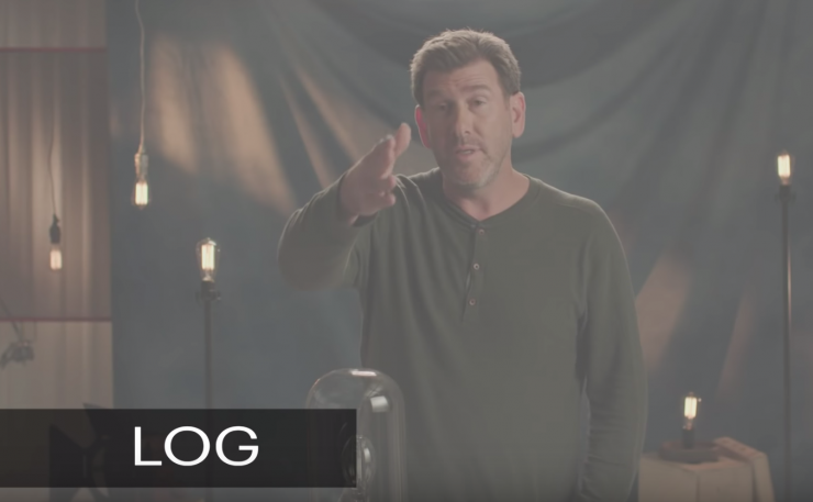
Sher first explains how the camera is set to bring color to the screen.
The digital camera shoots in Log, or flat footage. Log produces a flat, desaturated image, or digital negative, before color grading. In Log, the image looks flat, and drained of color, but its advantage is that it has a wide tonal range and shadow recorded by the camera’s sensor. In post processing, the editor or colorist can then recover the contrast, saturation, and hue and grade as they please.
The key point is that the color can be manipulated to conform to the look and color scheme of the movie as decided in pre-production. Colors can also be manipulated to evoke certain meanings within a scene.
The Three Elements of Color
Color is comprised of three elements: hue, saturation, and brightness.
Hue is pretty self-explanatory. It’s the color itself.
Saturation is the intensity or the brilliance of the color. When a pigment hue is “toned”, both white and black (grey) are added to the color to reduce the color’s saturation. “Saturation is probably the most subjective part of modern film-making,” explains Sher.
Brightness is sometimes referred to as value or tone. Values of color refer to shades or brightness levels. It indicates the quantity of light reflected. When referring to pigments, dark values with black added are called “shades” of the particular hue. Light values with white pigment added are called “tints” of a hue.

Color Temperature
Color temperature is how white looks on camera at a given temperature. They’re measured in Kelvin. You often hear about indoor temperatures like 3200 kelvin and outdoor temperatures like sunlight or 5500 Kelvin.
Often color temperature is associated with white balance. A cinematographer may want an object that is white in reality to look white in the recorded image, but it can also be manipulated to alter the color of a scene. When white is balanced correctly, all the other colors will be balanced correctly too.
But lower the color temperature then a white object, and the rest of the colors, can be given an orange, warmer tint on camera.
Conversely, a higher temperature is cooler and provides a bluish look.

Exposure and Image Tonality
Black and white shows depth through shadows and contrast and tone. Sher references the Zone System created by famous still photographer Ansel Adams.
The Zone System put exposure and tonality on a scale from 0 to 10, with 0 representing pure black and 10 representing white.
You can look at an image of all the tonalities on the scale in ten steps of exposure (as shown below).
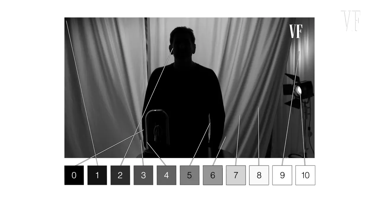
Thus, depth can be created through shadow, light, and darkness.
Creating Depth With Color
Color can also create depth. “Two things can be the exact same tonal range,” says Sher. “But if they’re different colors they create depth in the same frame.” Complementary colors, or colors on the opposite side of the color wheel is one way depth can be created within a scene. Blues contrasted with oranges, reds with greens, and yellows with purples, and so on.
So how does a cinematographer choose what colors to use?
Cinematographers have a good understanding of color theory. Color elicits psychological effects on the viewer, to evoke certain emotions and tell the story. But our reaction to color is often subjective. “The emotions, the characters. We all have associations with color. Memories. How we think about color.” says Sher.
Nonetheless, a cinematographer can use color to manipulate an audience’s emotions. Some cinematographers have created their own color theories. Sher is impressed by the work of Vittorio Storaro, the cinematographer of films like The Conformist, Apocalypse Now, and The Last Emperor.
He manipulated the mood of a scene through specific colors. So while color has meaning in film, its also an aesthetic choice by the cinematographer. And a good cinematographer can use them in different ways. Some will use a limited color palette or desaturation such as Tom Stern in Million Dollar Baby.
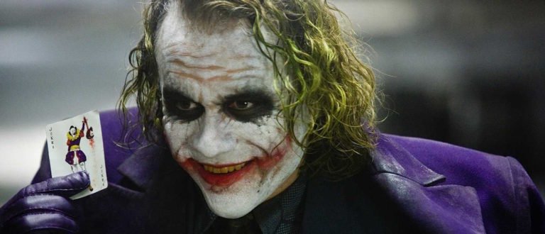
How does Sher Use Color in Joker?
Sher is interested in how color evokes mood and depth, and how it reveals character. In Joker, he often uses color to create a sense of dread.

Sher reveals a lot about Arthur Fleck’s psychology through color:
“Because Joker is a movie in large part about opposite ends of the spectrum. Two sides of yourself: the shadow and the light. And so those contrasting colors is a lot like what’s going on internally with Arthur and that color difference makes a huge impact on the scene.”
The color palette here in the scene above is full of contrasts. Sodium vapor creates separation when paired with the uncorrected cyan blue.
But the color also changes as the film progresses from scene to scene. Arthur at the beginning of the film is lost. But as he finds himself, by embracing his dark side, the colors become more vibrant. It’s dissonant for us to watch. As he gets darker, he is more hopeful.
Sher also lit Gotham like New York from the late-70s/early-80s, which is the time the film is set:
“A big part of the cities back then were the street lights and the street lights were sodium vapor…That green-orange gross light. That’s what we saw back then. That’s how the city represented itself on film, but also in our memories.”
In short, Lawrence Sher uses color to tell a story. Color has certain meanings. They can be manipulated to make us feel a certain way, but it also elicits our memories too.
But at the end of the day, Sher knows all the technical stuff is a bit overwhelming. His simple advice is to “just feel the scene. Feel the emotion of the lighting and try to express that as best you can.”
Joker Technical Specifications
Aspect Ratio:
- 1.85 : 1
Camera:
- Arri Alexa 65, Hasselblad Prime DNA Lenses
- Arri Alexa LF, Hasselblad Prime DNA Lenses
- Arri Alexa Mini, Hasselblad Prime DNA Lenses
Negative Format:
- 35 mm (titles)
Cinematographic Process:
- ARRIRAW (3.4K) (4.5K) (5.1K) (source format)
- Digital Intermediate (4K) (master format)
Printed Film Format:
- 35 mm (spherical) (Kodak Vision 2383)
- 70 mm (Kodak Vision 2383), D-Cinema