Inside the Mind of Anton Furst: The Man Who Put the ‘Gothic’ Into Gotham City
Learn how Anton Furst designed Gotham City with a deliberate mishmash and misuse of architectural styles, and how he combined them to give a sense of the Gothic, without relying on Gothic architecture.
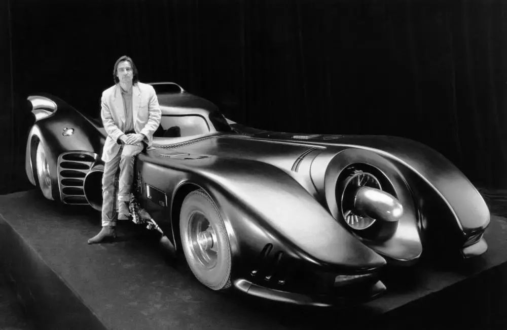
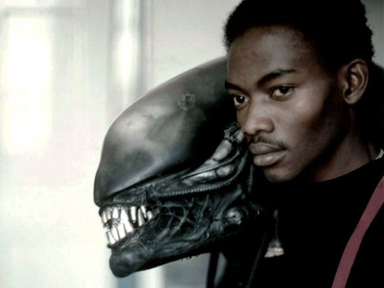
On Nov. 24, 1991, Anton Furst leaped to his death from the eighth floor of a Los Angeles car park. He was only 47. In his short life, he left a distinctive mark on big-budget film-making in special effects and production design. Few remember his special effects work; he is almost exclusively known for his first love, production design. The very best production designers create new worlds; draw us in with their visual style and suspend disbelief. Anton Furst will always rank among the best with his varied, and always distinctive, production design. Among his screen credits are the supernatural comedy High Spirits, and the creepy, Bruegel-like forest setting of Neil Jordan’s Company of Wolves. He also turned London’s docklands into the war-torn Vietnamese city of Hue for Stanley Kubrick’s Full Metal Jacket. But even transforming part of cold, damp London, into a humid Southeastern Asian city doesn’t compare to his reinvention of Gotham City for Tim Burton in 1989’s Batman.
With Anton Furst, you couldn’t find a production designer more aligned with director Tim Burton’s Gothic style. The pair were a match made in hell. That’s a compliment for a duo who relished the creation of Gothic hellscapes. But even Burton, with his ‘Gothic sensibility’, could not have envisioned Gotham City like Furst. The production designer’s dark, phantasmagorical cityscape is still the most iconic iteration of Gotham City.
Understand Where Furst Is Coming From
Furst’s Gotham has that Gothic feel (the gloom, the grotesque, the horror), which plays on the name Gotham City. But what is Gothic exactly? Gothic is often defined in a rather rudimentary way as anything dark, sinister, supernatural, with lots of low-lighting and shadows. Which is all true. But the Gothic has a long history, which spans architecture, fine art, literature, and film. And it has some specific characteristics.
Burton, of course, is interested in the characteristics of Gothic literature: dark, ominous, gated manors surrounded by mist, tragic heroes and anti-heroes, ghosts and monsters, and a fascination with the macabre, grotesque, and horror.
Furst was well-versed in Gothic architecture’s specific characteristics in medieval cathedrals: pointed arches, ribbed vaulted ceilings, taller and thinner columns, flying buttresses, gargoyles, and large internal spaces.
Both Burton and Furst were interested in how these tropes from Gothic literature and architecture translated onto film through set design, cinematography, and character. They were also interested in how these Gothic traits could be subverted.
Furst’s Gotham wouldn’t strictly adhere to Gothic conventions; rather he gave an overall sense of the Gothic in his designs through the use of other complimentary art movements and by forcing unrelated architectural styles to fit the Gothic look. Furst, like Burton, understood that the dark, low lighting and shadows of Gothic cinema gave birth to German Expressionism and film noir, which he used in his Gotham City.
All three movements share visual characteristics while also offering something fresh, especially when applied to architecture that is more modern than a Gothic manor or cathedral. Rather than resemble reality, German Expressionism represents the psychology of characters and elicits emotional responses in the audience through angular, distorted, and exaggerated structures and spaces. The dark spaces and looming shadows (long shadow is a key attribute of German Expressionism) from his Gothic-like structures allowed Furst (and Burton) to explore the noir roots in the early comics of Batman, which had not been seen before in any film or television adaptation of the Caped Crusader.
The early Batman comics were influenced by film noir, a new cinematic style in the 1930s. German filmmakers such as Fritz Lang escaped Nazi Germany to Hollywood bringing German Expressionism with them. Many of the traits from the German movement formed the foundation of film noir. Visually, film noir is characterized by stark lighting and dark shadows: a high-contrast mise-en-scene. Batman, originally a detective, is inspired by the 1930s detective plots of film noir. Art deco, a popular style in the 1930s, is pervasive throughout film noir set design and was also used by Furst in Batman.
But as we’ll see, Furst wanted his Gotham City to be disconnected from time and place. His Gotham has a Gothic retro-futuristic feel. He took a mishmash of architectural styles from a variety of different periods and re-shaped and stretched them into tall, dark buildings, and large and darkened internal spaces (with a belfry included) giving Gotham an overall Gothic effect.
Developing the vision
When Burton and Furst sat down to envisage their Gotham, they had a good starting point. The first line of the screenplay described Gotham as: “Hell erupted through the pavements and built a city.” This fit with the duo’s new conception of a far darker and more dangerous Gotham, which would bring a darker tone to Batman.
Today, it’s hard to understand what a gamble Burton and Furst’s vision was for Warner Bros. At the time, most audiences associated Batman with the colorful, campy 1960s TV series starring Adam West. There is nothing dark or gritty about the 1960s show with its vibrant, pastel color scheme, and campy action filmed against the sunny backdrop of Los Angeles doubling as Gotham City. If you comb through the entire series you’ll find the action is confined to interiors and on the streets. There are barely any nighttime scenes and not one scene takes place at the dizzying heights of one of Gotham’s skyscrapers.
A darker vision did exist in the comics, however. Burton and Furst were inspired by the “strong, heavy, solid look” of the original comics by Batman creators Bob Kane and Bill Finger, and the “strong graphic look” of Brian Bolland’s illustrations in The Killing Joke. Furst and Burton, though, would take the dark tone considerably further in their film.
The look of the city–its streets and buildings–would come from the real-life Gotham itself, New York City.
“Gotham City is definitely based in many ways on the worst aspects of New York,” Furst told Starlog Magazine. “There’s no doubt about it: the whole scenario is like the Mafia, gangsterism, the fact that it’s a very ugly city in many ways…”
”The way you can walk from some very beautiful place two blocks,” he told the New York Times, “and there’s a slum bar you wouldn’t want to go into, or you can stand on the smartest street and watch power stations belching out filth the other side of the Hudson or look down Park Avenue and see the Pan Am Building plonked on top of that wonderful Classical building, Grand Central Station.”
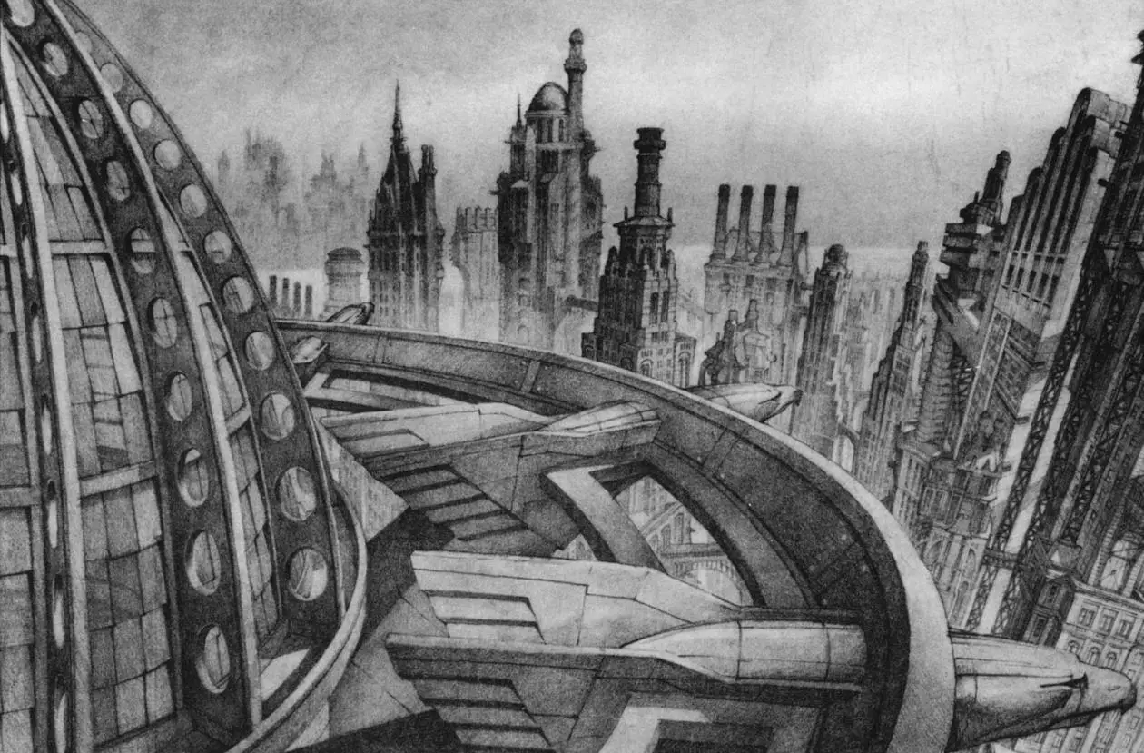
With Gotham, Furst wanted to take these disparate juxtapositions of jarring architectural styles a step further and put them into a block, a street, or even a single building. Imagine a New York City with no planning commission since its inception 200 years ago. That’s Furst’s Gotham. A deliberate mishmash of architectural styles that reflected no time period. A dystopian, retro-futuristic, and steampunk look that towered over its inhabitants and blotted out the Sun.
“We ended up with this rather interesting idea of canyons, with cantilevered forward structures and bridges over. That way, there is just a little light. We’re condensing the city even more and stretching it higher.”
Clashing Architectural Styles
Furst placed clashing architectural styles side-by-side, even growing out of each other, such as the Gothic stone in Gotham Cathedral, which towers above skyscrapers’ brutalist steel. Italian futurism, fascist architecture, and the work of iconic architects such as Shin Takamatsu, Antonio Gaudi, Frank Lloyd Wright, Eric Mendelsohn, Bauhaus, and Louis Sullivan. These somewhat incompatible styles were crowded together, to form a twisted, distorted version of itself.
Furst explained how he combined his eclectic architectural tastes to build Gotham:
“We even took things like prison architecture and stretched it into skyscrapers, and then [we brought in] the buildings of Louis Sullivan [a Chicago based innovator in skyscraper construction who lived from 1856-1924] and ziggurat structures going back and then cantilevering out, and fascism, and putting it all together into huge massive vent structures, so you’re always expressing the underground. And just brutality, absolute brutality.
Then, we put in modern architecture, just to confuse the issue, and it doesn’t look like a complete period piece. But if we put in modern architecture, we would also go for the brutalism, like Russian constructivist sort of buildings, along with this fascinating Japanese architect Shin Takamatsu who does, like, locomotive design and nuts and bolts architecture.
So, we’ve got an incredible anomaly of different styles. We have Anton Gaudi [1852-1926, leading Spanish Art Nouveau architect who designed the Sagrada Familia] stretched into a skyscraper, and we’ve got Otto Wagner [1841-1918, a leading Viennise architect] locked onto brownstone buildings with fascist fronts on it, and [Isambard Kingdom] Brunel-type Victorian bridges.”
Louis Sullivan’s credo was “form ever follows function.” Furst no doubt got the irony of using Sullivan’s designs in his chaotic mishmash design of Gotham. There is not much function in Gotham’s designs.
Furst’s Drawings
Furst’s vision is best understood through an examination of his individual designs. What is common in all his designs is the “broad stroke” which he emphasized in all his explanations of Gotham’s buildings. “The thing about Batman is it takes place 80 percent at night time,” he told an audience in 1990. “So there’s not much point in going into too much ornamentation…I just wanted phenomenally strong graphic images like a comic strip. I just wanted these big shapes.”
He added: “It’s the power of the image that matters.”
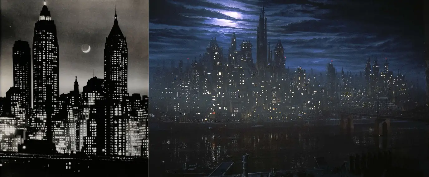
Establishing Shot of Gotham City
Andreas Feininger’s night photographs of New York’s skyline influenced Furst in the creation of Gotham’s establishing shot and skyline. This shot (below right), which is based on Furst’s pencil drawings, is a matte painting.
Street-Level Gotham
Then on Gotham’s streets, Furst’s extreme mishmash of architectural styles looms over Gotham’s citizens, almost pushing them out into the streets.
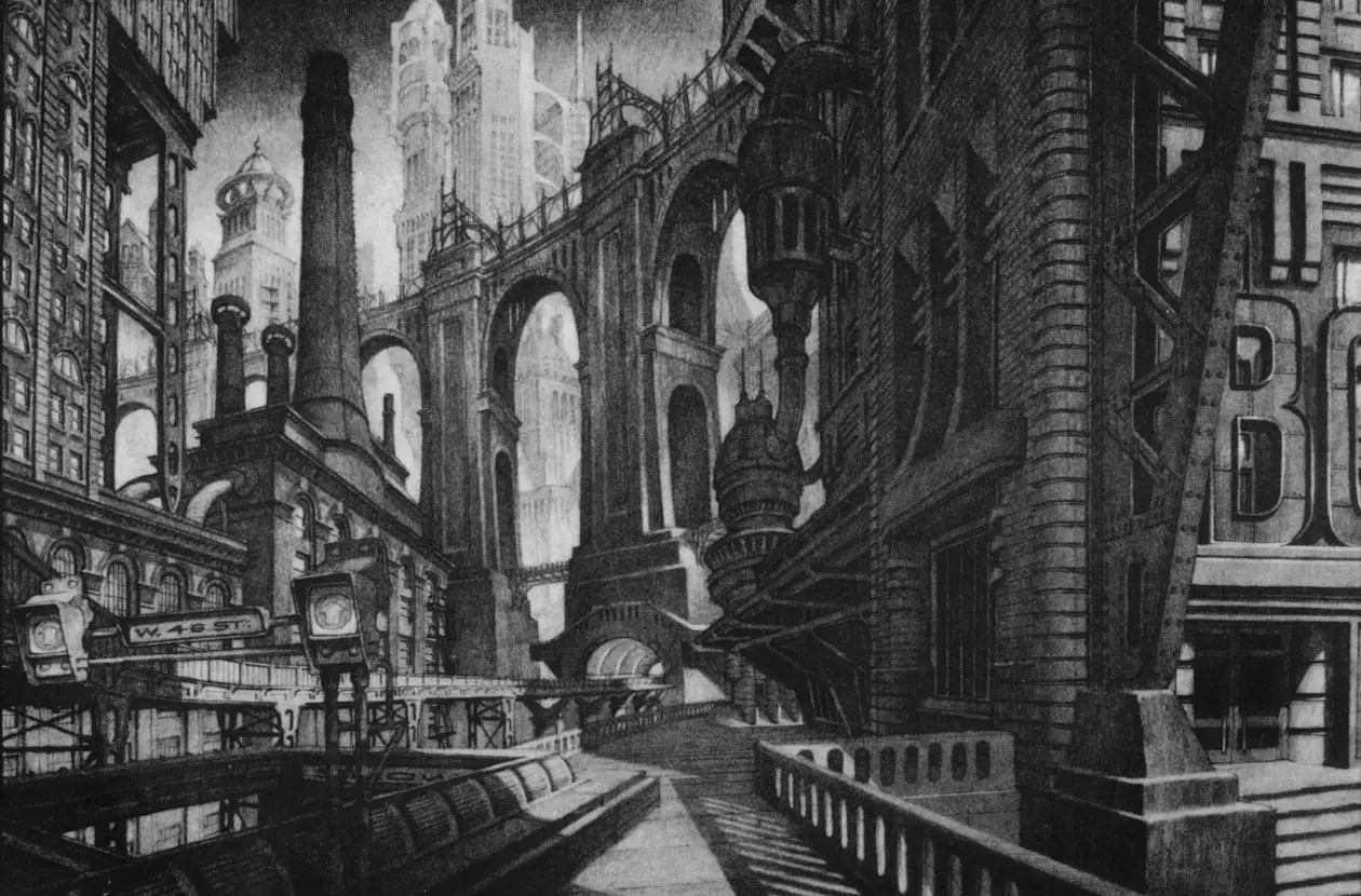
There’s always a feeling of danger in the streets. The dark alleyways conceal Gotham’s criminal underbelly and there’s even an element of danger from beneath the streets.
“I was trying to constantly give a chance to get steam out of this great machine-like thing, because, you know that extraordinary substructure to New York,” said Furst. “The week I arrived in New York to do this movie, I was driving up Third Avenue, and I said, ‘This steam doesn’t look safe to me. It looks like it’s all under pressure.’ And everybody said, ‘Yeah. It is. In fact yesterday 20 feet of pavement was ripped out of the ground and smashed three buildings to pieces. And twenty people were killed.'”
Flugelheim Museum And Monarch Theater
Furst described Gotham’s Flugelheim Museum as “a joke on the Guggenheim [Museum]”. But apart from the play on the name and using the Guggenheim’s skylight as the center window in Gotham’s museum, the Flugelheim took its design cues from the Ark Dental Clinic by architect Shin Takamatsu. Furst loved the grandiosity of the dentist’s office: “He’s got this Brutalist locomotive architecture. And then you suddenly read it [the sign] and it’s [just] a dentist.”
Furst also incorporated elements from Takamatsu’s work into Gotham’s Monarch Theater design.
Axis Chemicals
The sketch Furst did of Axis Chemical Factory “is sort of a joke on The Joker’s smile. An evil-looking building because his lair’s under there.” You see a mixture of styles going on. A bit more of [Eric] Mendelsohn…One of the problems with factories is they have a lot of pipework and it’s boring. So I wanted to come up with a big broad stroke, shapeless, monstrous, thing.”
Gotham Cathedral
Furst’s conception of Gotham Cathedral is a mastery of the cohesion of disparate styles. Only the astute can identify the mishmash of some of the most iconic structures seen in both architecture and film. Because Furst saw Gotham Cathedral as the “establishing part of the city”, like a Gothic cathedral was in Medieval Europe, he needed the structure to be higher than all the skyscrapers in Gotham standing tall at 1,000 feet (300 meters) high. And it also needed to be, as he described it, “like nothing else.”
For Furst, only one cathedral, the Sagrada Familia by Antoni Gaudi, fits this description.
“Gaudi is nowhere is he,” Furst laughed. “I mean where the fuck is he? He walked straight off another planet, plonks himself in Barcelona, and paid no attention to nobody else.”
Furst’s cathedral is a strange design. To the layman, Gotham Cathedral appears entirely Gothic. Just the look of the thing. But as Furst’s homage to Gaudi’s work, Gotham Cathedral is largely devoid of Gothic features. There are no straight lines, vaulted ceilings, or flying buttresses. Furst, instead, took Gaudi’s building and molded it into a Gothic shape.
“I basically stretched Gaudi into a skyscraper and added a castle feel.”
Furst and Burton also incorporated an homage to production design from Alfred Hitchcock’s masterpiece, Psycho. The top of Gotham Cathedral incorporates the third scale model of the House on the Hill where cross-dressing killer Norman Bates lived. Furst called the third scale model of the house used in Psycho “the best special effect of all time.”
Even though the Sagrada Familia is an imposing structure at 172 meters, it is still only about half the height of Gotham Cathedral (only on paper of course). To give his design and model of Gotham Cathedral that illusion of height, Furst returned to 1930s New York for inspiration. He explained:
“The problem here was to create a cathedral which was taller than the tallest skyscraper and still make it credible. I then remembered that some of the 1930s skyscrapers in New York produced a cathedral effect at the top by means of interesting Gothic detail. I began to solve the puzzle.”
The entrance to Gotham Cathedral once again has the Gothic look, but there isn’t one Gothic element. For columns at the foot of Gotham Cathedral’s entrance, Furst took sculpted heads that futurist Antonio Sant’Elia designed and stretched them into columns.
Furst deliberately designed a Gotham City that could not be located in time. It’s retro-futuristic. Furst said Gotham’s architecture was a Dadaesque juxtaposition of styles that hopefully became its own style. He combined architectural styles, that by themselves not only reflect a particular time period but are also elegant and beautiful when unsullied by the jarring integration of another incompatible architectural style.
Furst’s disparate architecture is an “essay in ugliness” (though a stylish ugliness), which he said was a necessity “to express the evil quality of Gotham City.” Gotham visually reflects the organized crime which runs the city. The people are surrounded and overrun by it. Furst’s designs truly reflected the first line of the screenplay: “Hell erupted through the pavements and built a city.”

