How ‘Mr. Robot’ Uses Lower Quadrant Framing to Create a Feeling of Oppression and Isolation
Mr. Robot is one brilliant, trippy, mindfuck exploration of Elliot Alderson’s mind. On the surface, Elliot is a hacktivist hero fighting against the conglomerate E Corp (Evil Corp). But deeper layers of meaning are revealed as the show goes on. At first, Elliot is similar to a choric figure: a commentator, whose hypnotic monologue seems to perfectly sum up the ills of society. But as the show progresses, more and more signs suggest that Elliot is losing his grip on reality. With each new episode, it’s increasingly difficult to discern where Elliot’s fantasy ends and actual reality begins. At the end of season 1, the big reveal is that Mr. Robot (Christian Slater) is a figment of Elliot’s imagination. He is Elliot’s dead father appearing to him and influencing his every decision.
From the get-go–from the very first frame of Mr Robot–a creeping uneasiness is felt. Something is a bit off. A visual tension is present in every scene. In every shot. As the show develops, this tension builds, emphasizing Elliot’s increasing sense of isolation, loneliness, and feeling of societal oppression. While most will focus on the cinematographer’s use of color and lighting to elicit these psychological effects, there is something else. Something less obvious. To compound Elliot’s isolation and loneliness, and to really generate a feeling of uneasiness in the audience, Mr Robot ‘s cinematographer, Tod Campbell, uses lower quadrant framing to compose each shot.
The way a shot is framed goes generally unnoticed by the audience, which is why lower quadrant framing is so effective in creating this uneasiness. The audience is used to the more conventional “Rule of Thirds”, which is more pleasing to the eye, and, as a result, typically generates a more positive feeling. How lower quadrant framing is used to generate more uneasy feelings is actually pretty simple, and highly effective.
For a nice explanation of the use of lower quadrant framing in Mr Robot, watch James Manning’s video below. Then, after the jump, we’ll break down the differences between “Rule of Thirds” and lower quadrant framing, and why they generate different psychological effects.
“Rule of Thirds”
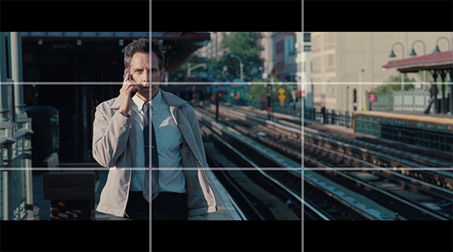
“Rule of Thirds” is the most conventional way to frame a shot. The frame is divided into nine sections by a series of equidistant horizontal and vertical lines (see below). In turn, the frame is divided into thirds when viewed from either a horizontal or a vertical perspective, which is where the phrase, “Rule of Thirds”, comes from.

In the frame above, lines and points of interest occur at 1/3 or 2/3 of the way up or across the frame, instead of in the center. This is because the eye typically views an image in a circular motion without directly focusing on the center of an image.
Here, actor Ben Stiller is positioned on the left of frame with the left vertical line running through the center of his body. Following the natural movement of the eye, the placement of the subject along one of these vertical (or horizontal) lines is more pleasing to watch. In addition, the eye line of a character is the primary interest in most “people shots.” In these shots, the eye line is placed a 1/3 of the way down the frame. But, as seen in this frame of Stiller, it is not always possible to place the eyes on this line.
In addition, Stiller is given further emphasis with the placement of his face on the intersection of the vertical and horizontal line. These are called reference or focal points, which is where the cinematographer and cameraman will typically place important features like a face or an object.
Placing the subject and an object in this way works as a form of visual vocabulary, and really is a way of organizing important features for the audience to notice subconsciously.
As a whole, “Rule of Thirds” gives the frame a fairly balanced composition. But it’s not the only way to frame, and depending on what mood is being communicated, it may not be the ideal choice.
Lower Quadrant Framing: Playing with Positive and Negative Space
Another way to look at the composition is the relationship between the subject and the surrounding space. The subject is the “positive space”, while everything surrounding the subject is the “negative space.” If you increase the amount of negative space around the subject then this can create visual tension and the feeling that something is not quite right.
Mr. Robot employs this device in almost every shot. By sliding a character down the frame to the lower right or left corners of the frame, cinematographer Tod Campbell has moved from conventional framing to the more unconventional lower quadrant framing. Head room is increased significantly creating an uneasy feeling of something looming or hanging over the characters heads.

More negative space elicits a feeling of oppression. The more the negative space fills the frame, the more the sense of its presence. Attention is frequently distracted by the negative space whether filled with giant screens in Times Square, the comings and goings of traffic and people, or just the empty space of a room. There is a visual dissonance as characters are made to feel unimportant and oppressed by the massive systems of society that surround and dominate them. Often it feels like characters are being forced out of the frame entirely.
In Mr Robot, as a consequence, the audience begins to feel how Elliot feels. And see the world through Elliot’s eyes.
![]()
Eliminate Leading Room to Create Loneliness and Disconnection
This visual tension between negative space and the characters amplifies the theme of isolation. Characters are frequently relegated to the margins of the frame. When a character’s head occupies a lower quadrant of the frame, isolation can be increased even further by playing with the gazing direction of the character, which Tod Campbell frequently does in Mr Robot.
Normally, if a character is placed on the left then their gazing direction will be to the right. With “Rule of Thirds”, the character has plenty of negative space, or leading room, on the right side of the frame. This gives the character breathing room. Furthermore, a character’s gaze provides movement to the right, as we, the audience, will follow the character’s gaze naturally to the right. The gazing direction then also provides balance to the right side of the frame.
But in Mr Robot, Campbell does the opposite. In the frame below, the character Angela has her back to the cavernous negative space to the left, while she gazes toward the nearest edge of the frame. In this way, she is perceived as a solitary and lonely figure.
![]()
This is even more effective in dialogue scenes. One conventional way to shoot dialogue is for both characters to face inwards with plenty of leading room in their gazing direction. In a single frame, one character will typically be placed on the left looking towards the right. And in the next frame, the other character is positioned on the right looking to the left of the frame. This naturally gives a perception of connection between the two characters as they converse.
In Mr. Robot, Campbell pushes a character’s face close to the edge eliminating leading room. Looking at stills from a conversation (below), it is almost as if the two characters are looking away from each other as they converse. Hence, creating a feeling of disconnection.


The use of lower quadrant framing in Mr. Robot perfectly captures the irony that in our hyper-connected, technical world, we’ve become increasingly disconnected from others, ourselves, and in some cases, reality.


